While Agentic Commerce is fast becoming the new buzzword in eCommerce, we at the digiDirect Group knew that any truly future-ready commerce platform had to start with one timeless principle: designing for humans first.
As we explore agentic AI experiences across the Group from personalisation engines to intelligent support workflows, our starting point wasn’t technology for its own sake. It was the customer experience.
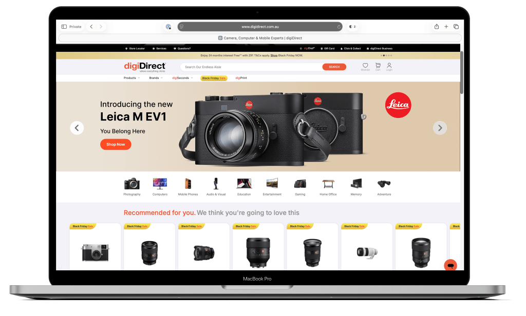
That’s why in late 2025, we launched Project GlowUp: a bold, UX-first transformation of digiDirect.com.au. The goal was to set a new standard not just for cameras and electronics in Australia, but to establish a design and experience benchmark for all four retail brands in our Group: digiDirect, Booktopia, James Bennett and Mwave.
Why digiDirect.com.au Needed a Radical Redesign
When I began working with the digiDirect Group, one of the top priority items on my desk was to evaluate the existing digiDirect.com.au site.
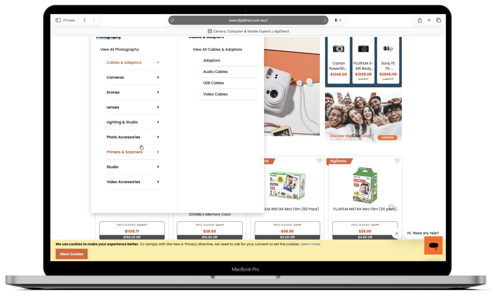
It had served the business well, but customer behaviour and device usage had moved far beyond what the platform could comfortably deliver. As we approached digiDirect’s 20-year milestone, it became obvious that this was more than a refresh opportunity. It was a chance to set a Group-wide north star for what today’s eCommerce should feel like: modern, seamless and elegant.
Coming from a strong background in Human-Computer Interaction (HCI) and User-Centred Design (UCD), I knew we couldn’t just layer a new skin over old assumptions. We had to start with observation.
We studied thousands of browsing sessions using:
- Heat-maps to identify dead zones and click bottlenecks
- Scroll-depth analysis to see where attention dropped
- Funnel analytics to locate conversion gaps
- Search behaviour recordings to reveal where navigation was failing
The patterns were consistent: clunky mobile navigation, heavy reliance on default non-optimised user journeys, and mid-journey drop-offs especially on mobile devices.
From there, we began rebuilding the experience brick by brick, click by click.

20 Years Young : A Milestone to Rethink Everything
The timing couldn’t have been better. For digiDirect’s 20th anniversary, we didn’t want a campaign or a badge on the homepage. We wanted to give the brand a new baseline, a Group-wide north star built on modernity, seamlessness and elegance.
This wasn’t a routine website upgrade. It was a clear signal that digiDirect is evolving. Instead of “reskinning” what we had, we used this milestone to radically reimagine the experience.
We looked to the world’s leading eCommerce giants for inspiration: the seamless usability of Amazon, the elegant simplicity of Apple, and the immersive brand storytelling of Nike. Not to copy them, but to hold ourselves to the same level of ambition and build a digital experience that finally matches the scale and reputation of the digiDirect brand.
Every decision, from layout and colour to motion and micro-interactions – was shaped by that ambition and by an uncompromising attention to detail.
A New Visual Language: Calm, Premium and Intentional
Underneath the UX changes sits a complete visual overhaul.
We wanted digiDirect to feel more modern, more premium and more composed, without losing its identity as a high-performing commerce site.
A few principles guided the new design language:
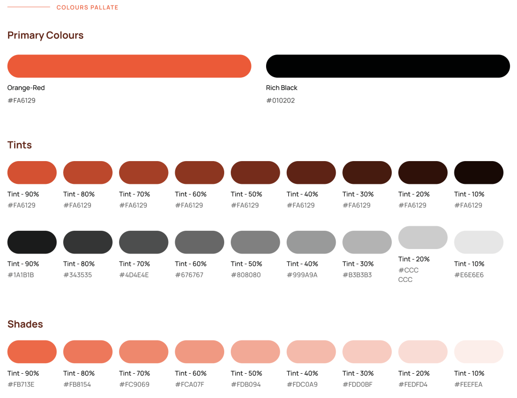
- Subtle, psychology-backed colour palette
We moved away from loud blocks of colour and harsh contrasts to a more refined palette: softer greys, controlled use of brand colours, and an overall calmer tone. Research in HCI and visual perception shows that reducing visual noise lowers cognitive load and increases perceived trust. The interface is designed to feel supportive, not shouty.
- White space as a feature, not a flaw
In eCommerce there’s constant pressure to fill every pixel with banners, promos and upsells. We took a different path. White space is used deliberately to create breathing room, clearer groupings and stronger visual hierarchy. The challenge was doing this without weakening the commercial weight of the page. We didn’t want digiDirect to look like an art gallery; we aimed for that sweet spot where clarity and commerce work together.
- Softer shapes, more human rhythm
We shifted from sharp, boxy containers and heavy borders to more harmonic rounded corners and subtle dividers. Cards and tiles now sit on soft grey tones that support the content rather than competing with it, creating a rhythm that feels more human and less mechanical, while still highly scannable at speed.
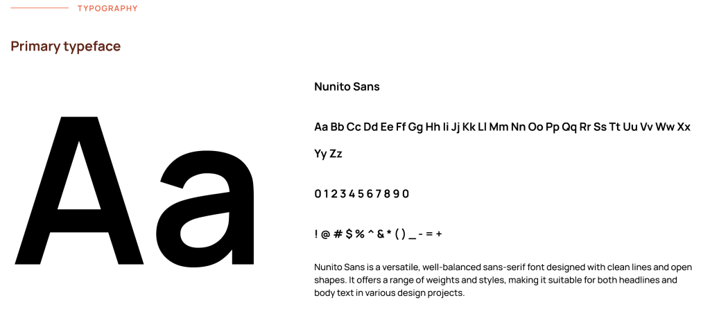
- Typographic hierarchy you can feel, not notice
We also paid careful, but deliberately subtle, attention to typography. Typeface choices, line spacing and font weights are tuned so that headlines guide the eye, product titles stay crystal clear, and supporting details never fight for attention. On mobile, type scales and spacing adapt so that content stays readable and touch-friendly without ever feeling cramped or oversized. The goal is for customers to effortlessly read and compare, without consciously thinking about the typography at all.
- Micro-interactions tuned to millisecond precision
We were obsessive about the tiniest details: hover states, tap feedback, easing curves and motion. Animations are timed in carefully chosen millisecond ranges so they feel snappy, not jumpy; smooth, not sluggish. We used simple principles of physics such as acceleration, deceleration and a touch of elasticity, to orchestrate transitions that feel natural and satisfying without ever becoming heavy for the browser to render. Whether it’s a mouse hover on desktop or a thumb gesture on mobile, every intentional movement is met with a clear, delightful response.
Evolution, not erasure, of brand identity
Core colours and recognisable elements remain, just used with more intention. The result is a visual language that feels new and elevated, yet unmistakably digiDirect.
All of this is anchored in well-established HCI and UCD principles: reduce noise, support natural scanning patterns, respect visual hierarchy, and use colour to guide rather than overwhelm.
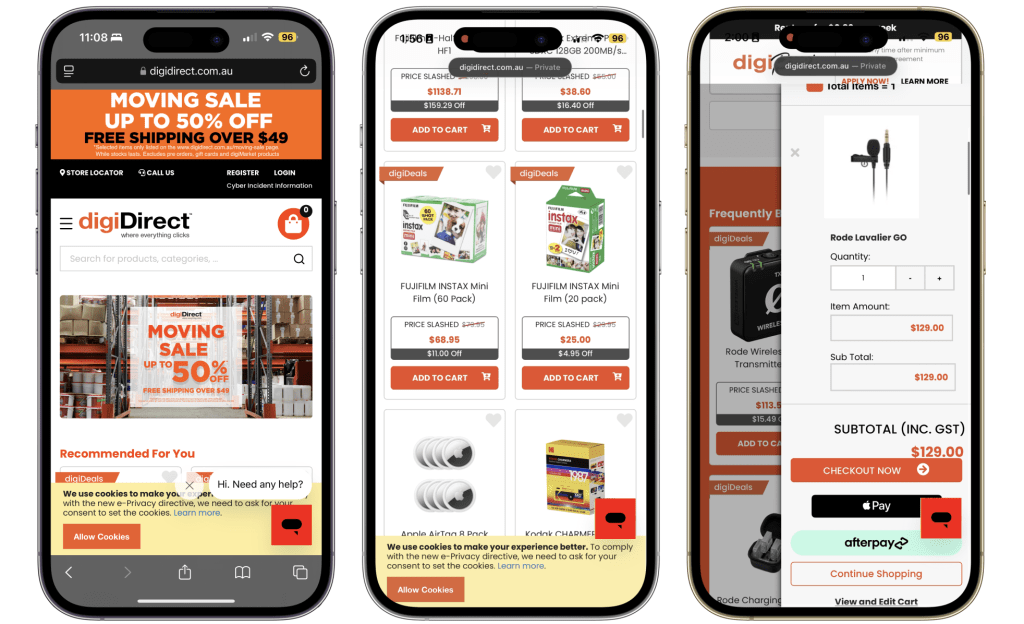
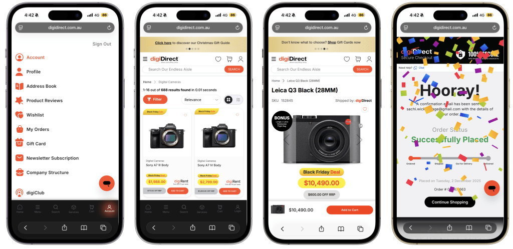
Designing a Mobile-First Experience that Feels Like an App
Even though digiDirect is a website, we chose to treat the mobile experience like a native mobile app, built around how real people search, browse and shop on the go.
The biggest leap forward is a floating mobile menu anchored to the bottom of the screen, always visible, always accessible. It includes quick access to Home, Categories, Search, Cart and Account, modelled after familiar app navigation patterns. This change alone has dramatically improved session depth and navigation clarity.

Compared to our previous mobile web experience where menus were harder to reach, key actions were scattered, and the journey felt fragmented. We have taken a mammoth step forward.
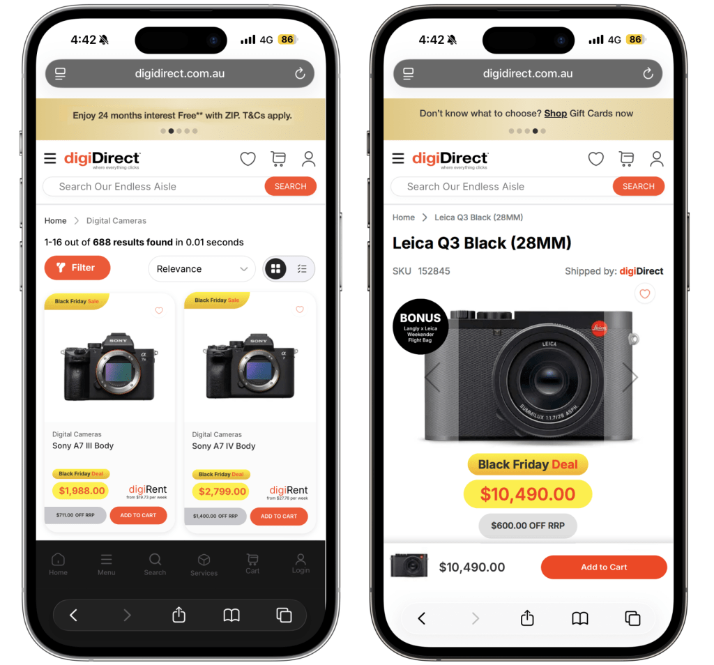
Side-by-side screens of the old and new layouts shown below make it obvious how much easier it now is for customers to move through the site with confidence.
Beyond “Responsive”: Designed for Modern Devices, Not Just Screen Sizes
From the outset, we knew we didn’t want a site that simply shrinks and stretches.
Traditional responsive design often stops at a few breakpoints and fluid grids. But our customers aren’t just using standard phones and tablets anymore. They’re on:
- Foldable and flip phones
- Ultra-wide and dual monitors
- High-DPI laptops
- A wide range of mixed aspect ratios
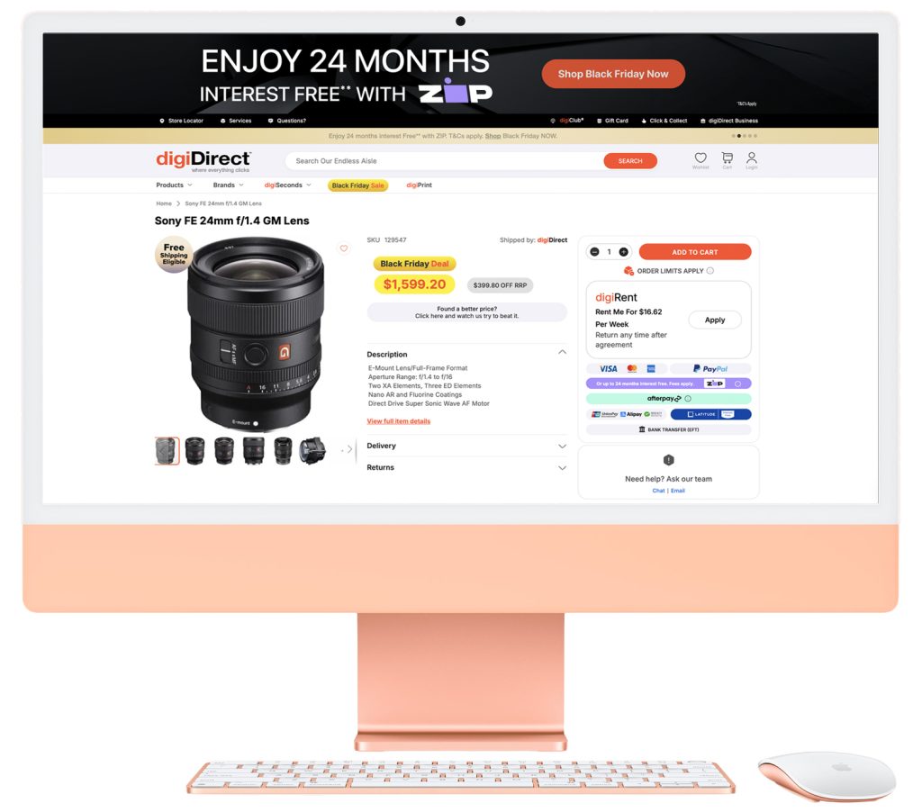
So instead of designing down to the smallest screen or up to the biggest, we focused on optimising the experience for each class of device.
That meant:
- Carefully planning breakpoints, layout behaviours and gesture-friendly patterns so that content doesn’t just reflow, but remains readable, balanced and easy to act on.
- Testing for extreme aspect ratios – tall, narrow viewports and wide, shallow ones to ensure navigation, product tiles and key actions still feel natural.
- Tuning spacing and typographic scale so that on high-DPI screens and modern phones, the interface feels crisp and intentional, not cramped or blown out.
The goal was simple: whatever device someone uses, the experience should feel as if digiDirect was tailored for that screen, not merely squeezed into it.
This is where HCI thinking really matters. We looked at how people hold devices, how thumbs travel, and how attention moves across different aspect ratios, then used that to guide layout, tap targets and content density. The result is not just a “responsive” site, but a device-aware experience that respects how people actually browse, compare and buy in 2025.
From Confusion to Clarity: A Reimagined Navigation Structure
Navigation was another major shift. On the previous site, the navigation structure was fragmented and confusing. There were multiple ways to get lost before landing on the right destination.
We:
- Simplified and consolidated bloated menus
- Re-structured categories based on real user intent and search patterns
- Introduced a clearer hierarchy and navigation logic grounded in research

Simplified and holistic Navigation Structure of the new digiDirect website
We audited over 15 leading global camera and electronics retailers, noting what worked, what didn’t, and where digiDirect could meaningfully differentiate. We paired that with deeply researched UX best practices from:
- Baymard Institute
- Google’s Retail UX Playbook
- Nielsen Norman Group
Every decision was evidence-based, not preference-based.

Personalisation as a VIP Concierge, Not a Pushy Salesperson
Alongside the visual and UX overhaul, we introduced a more advanced personalisation and AI-driven assistive layer across the digiDirect experience.
The principle was simple: support the customer’s journey, don’t hijack it.
We designed our recommendation engine to behave more like a VIP in-store concierge than an over-eager salesperson.
Behind the scenes, our systems:
- Observe navigation patterns and browsing depth in real time
- Learn from the categories, brands and price bands a customer naturally gravitates towards
- Surface context-aware suggestions at key points – not constantly, and never randomly
When someone is exploring bodies, lenses or lighting, they aren’t bombarded with generic “people also bought” spam. Instead, they see thoughtful, relevant options that genuinely help them complete their setup or discover the next logical step.
All of this happens within the user’s explicit cookie-consent choices. Where a customer has opted in, we use behaviour analysis to:
- Welcome them back in a way that feels familiar, not intrusive
- Offer seamless continuity from where they left off, navigate through recently viewed items, in-progress comparisons, carts and wish lists
- Subtly tune content and recommendations so the site feels like it “remembers” what matters to them
It’s a delicate balance: too much and it feels manipulative; too little and it feels like we’re not paying attention.


By tuning when and how these AI-driven suggestions appear, we aim to make customers feel guided, not pushed. The digital equivalent of a knowledgeable store assistant who knows when to step in and when to simply let you browse.
For us, personalisation isn’t about squeezing extra revenue out of every visit. It’s about making every visit feel more considered, more helpful and more human.
A Bold Launch, Historic Results
We launched the new digiDirect.com.au experience in mid November, just weeks before Black Friday, Cyber Weekend and Cyber Monday, the most intense trading period of the year.
It was a courageous time to introduce such a radical change, but the results spoke for themselves. Across that promotional window we recorded the most successful sales performance in digiDirect’s 20-year history, comfortably surpassing all our expectations.
Already we are seeing:
- A clear uplift in engagement across key user journeys,
- Stronger depth of browsing, especially on mobile devices,
- Positive customer feedback validating that this is the experience our loyal community had been waiting for.
For a website generating hundreds of millions of dollars in annual revenue, this level of Top User Experience was long overdue. What we have now is not just a better-looking site, but an exceptional digital experience that blends strong design, intuitive usability and seamless technology integration, finally aligned with the scale and ambition of the digiDirect brand.
Setting the Pace for the digiDirect Group’s Next Chapter
digiDirect Project GlowUp doesn’t just redefine digiDirect.com.au. It sets the tone and direction for every brand under the digiDirect Group.
The standard we’ve now set for visual design, usability and performance is the same standard we’ll carry into the evolution of Booktopia, James Bennett and Mwave. The aim is to operate not just as a collection of strong brands, but as a Group delivering consistently exceptional digital experiences across every touchpoint.
In many ways, digiDirect Project GlowUp is the first expression of where we’re heading as the digiDirect Group.
Our Next Frontier: Building an Agentic AI Commerce Engine
And this is just the beginning.
The next phase of our journey is about what happens under the hood: deeper Agentic AI and advanced technology that quietly works in the background to make every interaction smarter, faster and more personal.
We are now focused on:
- Agentic systems that can orchestrate the end-to-end journey from discovery to checkout to post-purchase support,
- Real-time decisions that adapt to each customer’s context, behaviour and intent,
- AI “co-pilots” embedded across search, recommendations and service flows, supporting both customers and internal teams.
We approach this with a single non-negotiable principle:
Retail AI must keep the customer at the centre, not the algorithm
Our ambition is for digiDirect and every retail brand in the Group to set new benchmarks in best-in-class retail AI experiences:
- transparent, not opaque
- helpful, not pushy
- human-centred, not hype-driven
If the GlowUp was about giving our customers the interface they’ve been waiting for, the next chapter is about giving them the intelligent, agentic layer they deserve. One that feels less like being “targeted” and more like having the right help at exactly the right moment.
The Hearts and Minds Behind the GlowUp
None of this would have happened without the people behind it.
From the very beginning, Shant Kradjian digiDirect Group’s visionary Founder and CEO, has treated digital experience as a core strategic asset, not a side project or a “nice to have”. Long before I began working closely with The digiDirect Group , Shant invested in a previous start-up I CoFounded, where we had conversations around the same idea: if you want to build a powerful brand, your technology and your experience have to carry the same ambition as your business strategy.
Shant was always clear that websites and platforms are not just sales channels, they are where customers feel the brand, test its promises and decide whether to trust it. digiDirect Project GlowUp is, in many ways, the realisation of that long-running discussion: a digital experience that finally reflects the scale of his vision for the digiDirect Group and the expectations of the customers who choose our brands.
What we’ve now delivered with digiDirect.com.au is, in many ways, the first visible expression of that shared vision at Group scale.
Alongside Shant, Haig Kayserian the Group Director of the Retail & Logistics, has been the driving force who turned that vision into a non-negotiable priority. He backed a bold, UX-led transformation in the middle of a high-stakes trading calendar and gave me and the team the space to do it properly while still hitting the numbers.
And then there is the team who actually built it. I’ve been incredibly fortunate to work with a truly global crew, both onshore and offshore – who made this transformation real. From Manila to Colombo, Sydney to London, people worked around the clock, often balancing BAU and Project GlowUp in parallel, driven by a single shared goal: to lift the digiDirect brand to the next level and better serve our loyal customers. They weren’t just closing Jira tickets or pushing pixels. They were reshaping how one of Australia’s leading camera and electronics retailers shows up for its community online. Every late night, weekend push and design or engineering review was anchored in one belief: our customers deserve an experience worthy of the passion they bring to their craft.
I’m deeply proud of what this global team has achieved and even more excited about what we will build together next.
Article written by:
Sachi Wickramage
Head of Technology & Experience
The digiDirect Group